
Create a QR
Error correction levels: what a QR code survives, and what it does not
A QR code carries copies of its own data. The level you choose decides how much of the square can be lost and still read — and how dense the square becomes. Those two things move in opposite directions, which is why the safest setting is not always the best one.
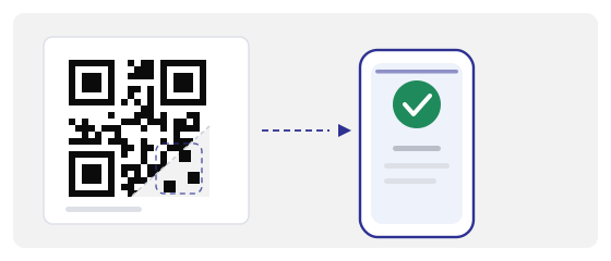
What the four levels actually promise
There are four: L, M, Q and H. Roughly, L lets you lose about 7 % of the code, M about 15 %, Q about 25 % and H about 30 %. The number is not a percentage of the picture. It is a share of the encoded data blocks — the error correction works on the data, not on the image, and it can rebuild blocks that were destroyed or misread.
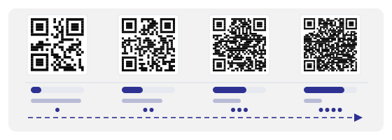
The catch: a safer level makes the code denser
Error correction is paid for in modules. The same link at H needs around a third more squares than at M. On the same printed size, every module gets smaller — and module size, measured in millimetres on paper and in pixels on the camera sensor, is what actually decides whether a scan happens.
So the level and the physical size are one decision, not two. Going from M to H on a 2.5 cm table sticker can make the code harder to read, not easier, because you added redundancy while shrinking the thing the camera needs.
What error correction does not protect
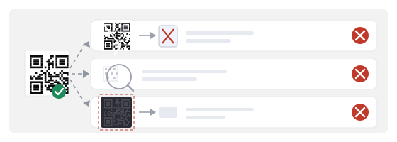
This is the part that surprises people. The level protects the data. It says nothing about the landmarks every scanner uses to find and orient the square in the first place — the three large squares in the corners, the small alignment squares, the timing pattern that runs between them, the quiet zone around the edge, and the format information that records which level was used.
Damage in the three corners
Scanners look for those large squares first. Lose or distort one and the phone may never locate the code, whatever your level says. H does not help here at all.
The quiet zone trimmed away
Cutting the white margin off to fit a design is one of the most common causes of a code that will not scan, and completely unaffected by error correction.
A logo over the centre
The middle looks safely recoverable, and for the data it is. But a large opaque patch also wipes the alignment pattern on bigger versions, and the camera loses the grid it was counting on.
Why “always use H” is bad advice
H is not a strength setting you should max out. It is expensive: more modules, tighter grid, smaller dots for the same physical size, and a longer code for the same data. Choose it because you need the redundancy — a logo, heavy wear, a design overlay — not because more sounds safer.
The right question is not “which level is strongest” but “how much of this square is going to be lost in the real world, and can the printer still put enough pixels on each module”.
Choosing a level by where the code will live
A code on a clean poster behind glass, read from a metre away: M is plenty. A code on a laminated menu that gets wiped down twice a day: Q. A code printed on a curved bottle where the surface distorts the grid: Q or H, and a bigger code than you think. A code with a logo in the middle: H, and only if the finished size allows it.
The pattern is simple. The level should match how much abuse the printed object takes, not how important the link feels.
If you want a logo in the middle
Keep the logo under about a fifth of the code's area, centred, on a light background, and never overlapping the three corner squares, the alignment marks or the quiet zone. Build the code at H so the data survives, then let the logo eat into that redundancy — that is exactly what the level is for.
And test it. A logo that looks fine on a monitor can be the difference between scanning in half a second and not scanning at all when the phone is at an angle.

Module size and distance matter more than the level
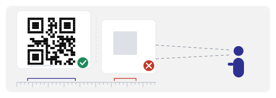
Two practical limits dominate everything else. First, each module should be roughly half a millimetre or more on paper; below that, ordinary printing and ordinary cameras start losing the grid. Second, the code should be about a tenth of the distance from which people scan it — a code read from two metres wants to be around twenty centimetres across.
If you are choosing between “raise the level” and “print it bigger”, print it bigger. A larger M usually beats a small H.
A dynamic code does not rescue a badly printed one
It is worth being clear about this, because it is a common assumption. A dynamic code lets you change where the link points after printing. It cannot change how the square was printed: the level, the module size, the quiet zone and the paper are fixed the moment the ink dries.
So the level you pick is permanent for that print run. If a code fails in the field because it was printed too small or at H on a tiny sticker, repointing the link changes nothing — the fix is a reprint, and a new decision about level and size.
How to test before you pay for the print run
Print a single copy at the final size, on the final material, and scan it the way a customer would: from the real distance, in the real light, holding the phone at the angle people actually hold it.
Then damage a spare copy on purpose. Rub it with a thumb. Fold a corner. Put it under a bright window and look at the reflection. Scan again. A code that survives a deliberate thumbprint and a folded corner will survive a normal week on a table.
Repeat the scan with the oldest phone you can find in the building. Newer cameras compensate for a lot; the scan that matters is the one from the device someone actually carries.
When a code fails in the field, what actually happened
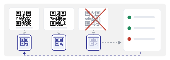
Almost never “the level was too low”. In practice it is a crease running through a corner square, glare off glossy laminate, a printer that quietly reprinted the file at lower resolution, a sticker faded by a year of sun, or a designer who trimmed the white margin to make the layout tighter.
Only a small share of real failures are data loss in the middle of a well-printed code — which is the one thing the level is designed to fix. That is why physical care and correct printing beat raising the level almost every time.
Common mistakes
- Choosing H for a small sticker, then wondering why a bigger, denser code reads worse.
- Cropping the quiet zone to fit a layout — the single most avoidable failure.
- Putting a logo over a corner square or an alignment mark instead of the centre.
- Assuming a dynamic code can fix a poor print after the fact.
- Testing only on a monitor or on the newest phone in the room.
- Skipping the deliberate damage test, then discovering the problem after the print run.
How to set it up in practice
In the QR generator, pick the level where you create the code, and check the result before you commit: if the preview looks visibly denser than you expected for the size you plan to print, that is your warning. For anything handled by hand, Q is a reasonable start; H is for logos and overlays.
In the QR Studio you place the artwork around the code, so this is where the quiet zone gets lost. Keep the margin, keep the logo out of the corners, and keep the contrast high — the studio keeps the printable area honest so the layout does not quietly eat the parts that make scanning possible.
Then use the QR scanner as the last gate: scan the actual print, scan a photo of the actual print, and scan it with the light you expect. If it reads there, the level and the size were the right pair.