
Useful materials
Website QR codes: turn print ads into traffic
A poster can hold a dozen words. A URL is forty characters of noise. A QR code is the only part of a printed page that can carry someone straight to the right page without typing anything.
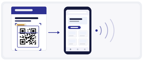
A QR code is just a link you can point a camera at
There is no separate "QR internet". The code holds a URL, the phone's camera reads it and opens that URL in the browser. That is the whole mechanism, and it is why a QR code to your website is the simplest useful code you can print.
Which also means the code is only as good as the page behind it. A beautiful code that opens a slow, narrow, half-empty page wastes the print run. The scan is the easy part.
A QR code never makes a page better. It only makes the page easier to reach — and easier to walk away from if it disappoints.
Homepage or landing page
This one decision shapes the result more than colour, size or position. Ask what the printed piece promised, then send people to exactly that.
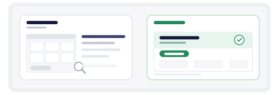
Homepage
Fine for general branding — "find out who we are". Weak for anything with a deadline, because the visitor has to hunt for the offer and most will not.
Landing page
One offer, one next step: "−20 % on your first order", event sign-up, catalogue download, booking form. Matches the promise on the poster.
If the printed piece advertises a specific promotion, the code must open the page for that promotion. Every extra tap or decision between the scan and the offer costs a large share of the audience.
Where a website QR earns its place
All four share one trait: someone is standing still long enough to lift a phone. That, not the cleverness of the code, is what decides whether it gets used.
Deep links: the exact page, not the front door
Most website QRs point at the root domain when they should point at a section. If the poster promotes one product, the code goes to that product page. If the leaflet is about delivery, it goes to the delivery page. If someone scans a table card, they want the menu, not the homepage carousel.
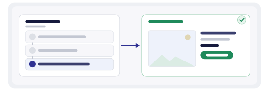
Deep links also make measurement readable: each destination is a distinct URL, so your site analytics already separates poster traffic from packaging traffic before you configure anything. Add a campaign parameter on top and the split becomes exact.
Print rules that decide whether it scans at all
Everything below is checked in two minutes and costs nothing. Almost every "the QR code doesn't work" complaint comes from one of these five.
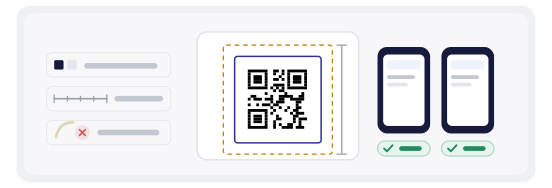
- size: a comfortable minimum is around 2 cm per side for a hand-held scan at 30 cm; for a poster seen from two metres, scale it up, not down
- contrast: dark modules on a light background — inverted codes still fail on a noticeable share of phones
- quiet zone: leave the empty border around the code; a background photo touching the modules is a common killer
- placement: keep it off folds, seams and curved surfaces, and away from varnish or laminate that reflects light
- test: scan the actual printed proof with an Android and an iPhone before the full run
Then add the words. A code with no label asks the reader to guess; a short line next to it — "Scan for the full range" — is the cheapest improvement available and often doubles the scans.
One code that can change its mind
A static code contains the URL directly: change the page and the printed code is wrong forever. A dynamic code contains a short redirect address, and the destination behind it can be edited in your account after the print run.
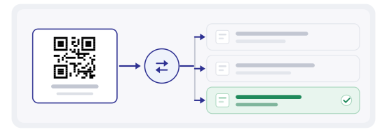
That is the difference between a campaign you can steer and a campaign you can only regret. Poster up for a month? Point it at the offer this week, the new product next week, the closing date in the final days — one printing, three messages.
Be honest about the trade-off: a dynamic code depends on the redirect service staying online. Choose a provider you intend to keep, and export a static version for anything meant to survive for a decade — a tombstone, a permanent sign, a printed book.
Measure the visit, not just the scan
Scan counts answer "did anyone bother". They do not answer "did the page work". Read both: scans from the code dashboard, sessions and conversions from your site analytics.
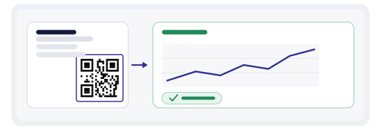
The two numbers together tell you which problem you have. Plenty of scans and no conversions: the landing page is wrong. Almost no scans on a busy poster: the code is too small, too low-contrast, or in a place the eye never reaches.
Tag the URL with a campaign parameter if you want the split inside your own analytics rather than only in the code dashboard. It takes one line and makes the numbers comparable with your paid channels.
Building it in practice
The generator turns a URL into a dynamic code in about a minute, named so you can tell campaigns apart later. The QR Studio is where the code becomes something you can actually print: colour, logo, templates, correct margins and export resolution for a poster or a sticker sheet.
Before the print run, put every code through the QR scanner and confirm it opens the page you meant. A poster that sends people to last month's offer is worse than no poster: you paid for the printing twice.
The mistakes that waste a print run
- one code used on every channel, so the total tells you nothing about which channel worked
- a code pointing at a page that no longer exists, discovered only after the posters are up
- a code placed where the fold, the frame or the product itself covers part of it
- colour inverted for style — light modules on a dark background — and a share of phones refuse it
- no label, so the reader has no idea what they get for lifting the phone
- changing the destination mid-campaign, then wondering which version produced the result