
QR Studio
Studio templates: which one for a menu, a card or a poster
A template removes the dullest part of the job — sizes, margins and layout. But you pick one by where people will scan from, not by which looks best on screen.
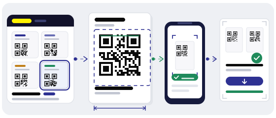
Why use a template at all
A ready layout already has the right code size and the empty margin around it. That margin looks like wasted space, yet it is exactly how a camera finds where the code starts.
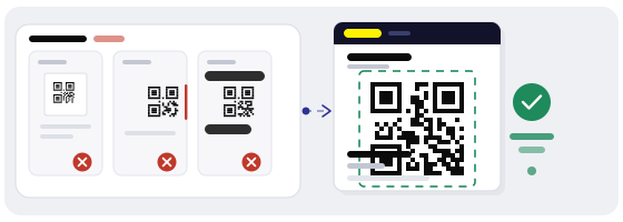
A template kills three mistakes people make by hand: a code that is too small, a code jammed against the edge, and text that creeps over the square.
It also keeps everything looking like one family. When the menu, the door sticker and the flyer come from the same template, people recognise your code before they read a word.
Start with the scanning distance
Size is set by distance, not taste. A workable rule: one centimetre of code for every ten centimetres of distance, plus a little slack for an older phone.
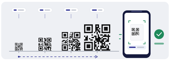
If you are torn between two sizes, take the bigger one. Shrinking a code on paper is easy; enlarging one that is already printed is not.
Which template suits which job
Choose by where it will live. A poster that looks lovely in the editor turns into a grey smudge on a wall two metres away.
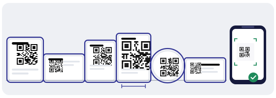
What you can change, and what you cannot
Change colours, fonts and text freely — that is your brand. Add a logo too, as long as it is simple and stays under about a fifth of the code area.
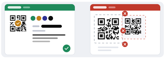
Do not move the code out of its slot, do not squeeze the quiet margin, and do not stretch the square into a rectangle. Those three are what actually break scanning.
One more on backgrounds: not every scanner reads a light code on dark. If you want a dark design, keep everything around the code dark and leave the code itself black on white.
When to break the template
A template is not a law. Some jobs are better served by bending it.
Breaking a template is fine when you know what you are breaking. Trouble starts when people break it at random.
Five checks before you export
- The code is at least as big as your distance requires.
- There is an empty margin around it of at least a quarter of a module.
- No label overlaps the square or touches it.
- Contrast between code and background is no weaker than half-black on white.
- The file was exported at print size — not stretched later inside a layout.
Mistakes that only show up on paper
In the editor everything is perfect. On paper the things you could not see appear: thin lines vanish, grey turns greyer, and a logo in the centre becomes a dark blot.
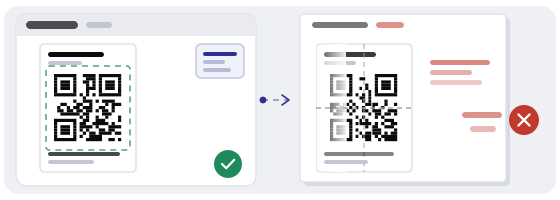
So before the print run, print one sheet on an ordinary printer and hold your phone up to it. Five minutes tell you more than an hour in the editor.
How this works in the QR Studio
In the QR Studio a template already carries the right canvas size, the grid and the slot for the code. You change the text, colours and logo, and the geometry stays correct.
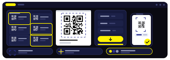
Before printing, run the finished code through the QR scanner — it shows what is inside before anything opens. And if you just want a plain code with no styling, the generator is right there.